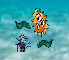
Looking back on the MiniLudumDare featuring sharks, I wanted to briefly recap what we made and offer criticism about it so that maybe in a future update or revision I can make the game better!
Read on for things I liked or didn’t like about my little 15 hour beat-em-up.
So SwagShark was an absurd idea that we planned out as a joke but it began to pan out as an actual arcade-style game we wanted to make.
I loved the enemy design, art, and combat mechanics. Simple and sweet was the goal. We didn’t want to over complicate things. What I don’t like about the art was the background image we decided on. We made the decision because it was supposed to look “retro” and “pixelated” on purpose. It wasn’t supposed to look nice, but purposely ‘bad’. But sadly it didn’t come across as such. It kind of hurts my eyes when playing.
Combat wise, the one thing I want to change eventually is how bouncy everything feels. The hit collision is certainly not the best. I remember designing it as hacky too at the time. So I really want to redesign some of it at some point should I go back to that.
Difficulty wise, its just right. Its a ridiculous game, and its supposed to have a ridiculous difficulty. Eventually you DO get overwhelmed, its just a matter of when. That can be super random due to the random enemy spawn I made. I would just need to fine tune that a bit.

